- General information:
- Setting up and configuration of widget:
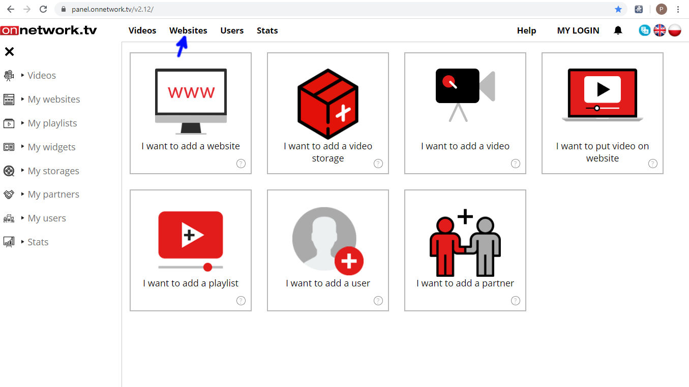
- Select Websites from top bar menu:
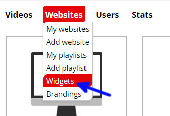
- Select Widgets after hovering mouse over it:
- Click Add button (marked with blue arrow) to create new widget:

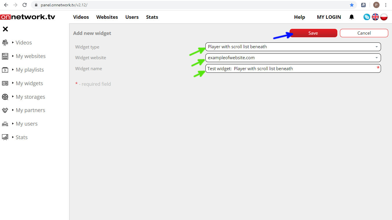
- Select Player with scroll list below as the widget type, choose website where widget will be located and name widget
(name will be seen only on Platform) as marked with green arrows. Save with blue arrow marked button:
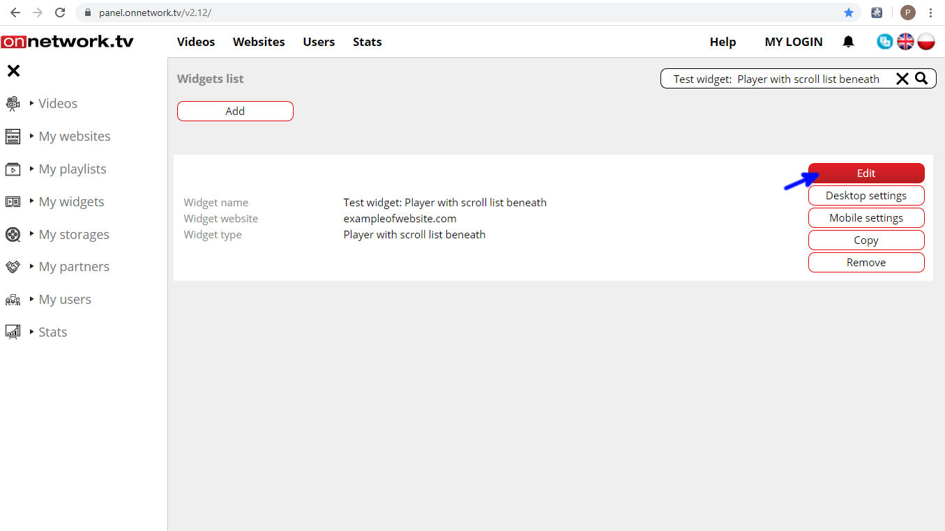
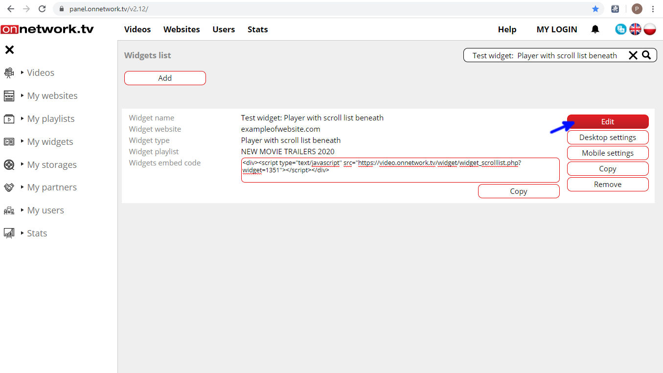
- To continue configuration of the widget and generate embed code click on Edit
button marked with blue arrow:
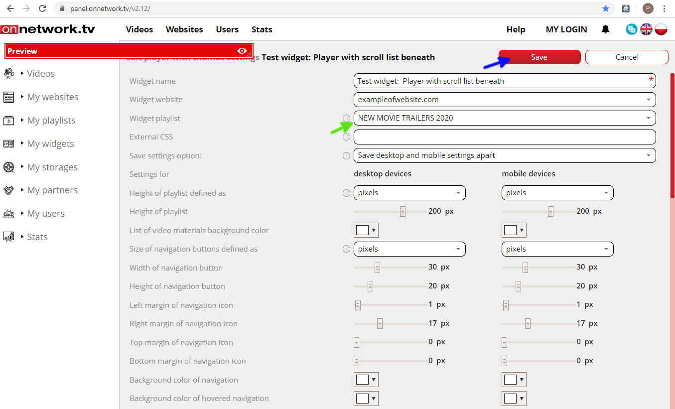
- Choose the playlist that shall be displayed in the widget (green arrow) and Save your settings (blue arrow):
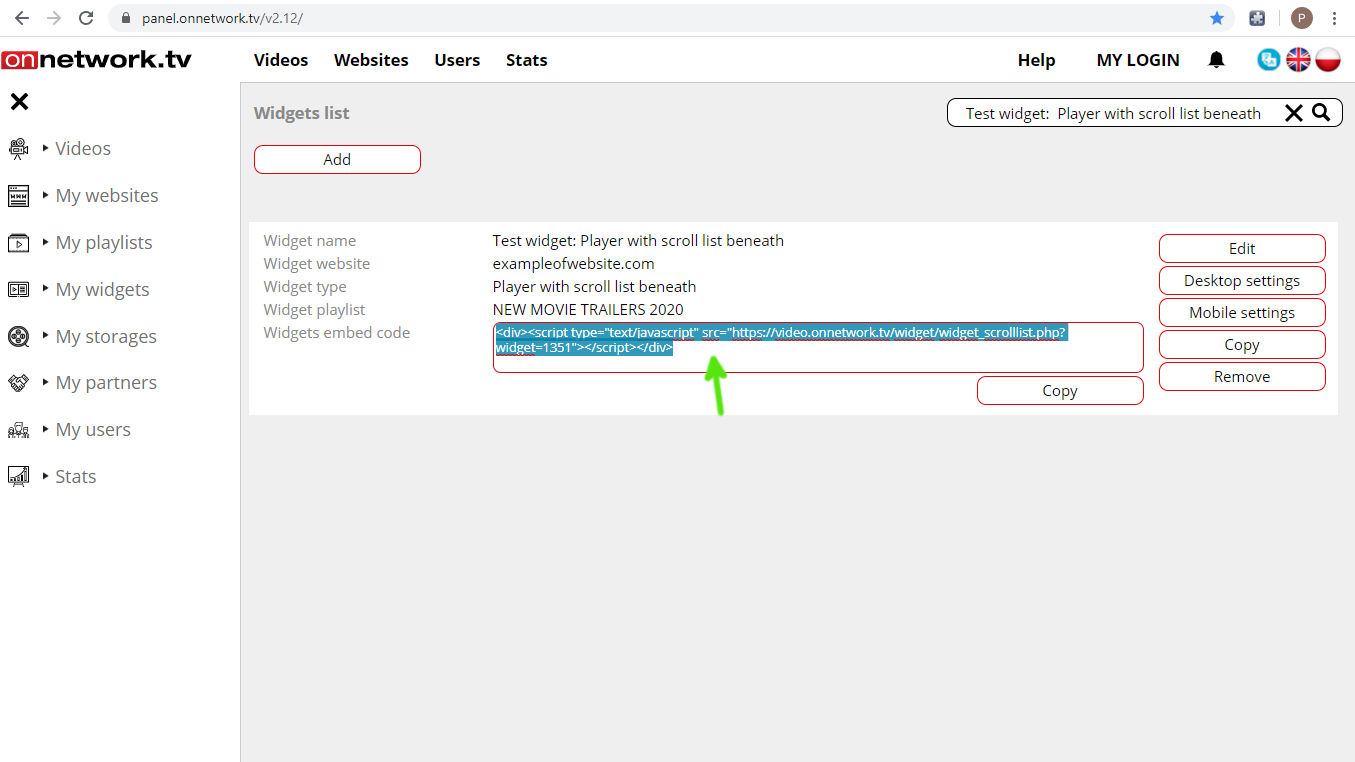
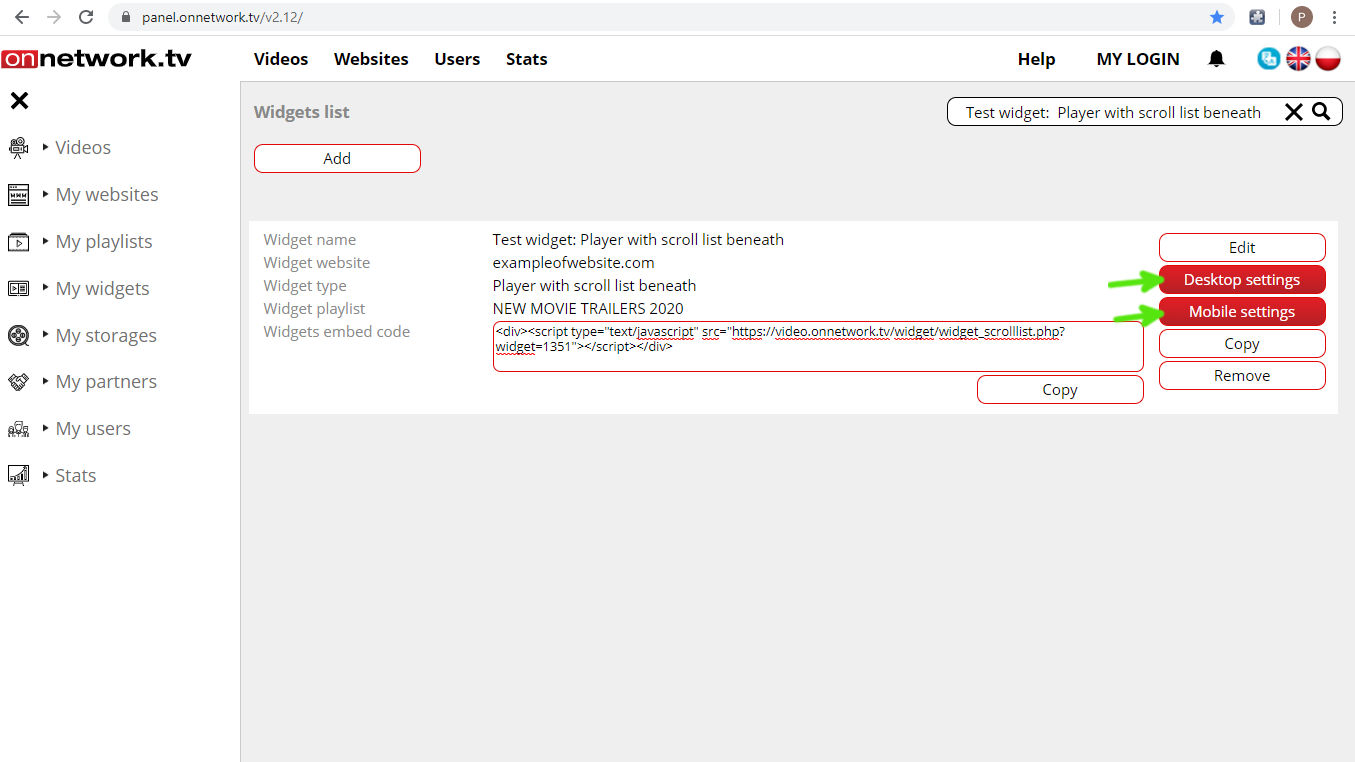
- You are moved back to the Widgets list. Together with your new widget the embed code of the widget is displayed (green arrow).
Copy the embed code to the source code of defined website to activate the widget:
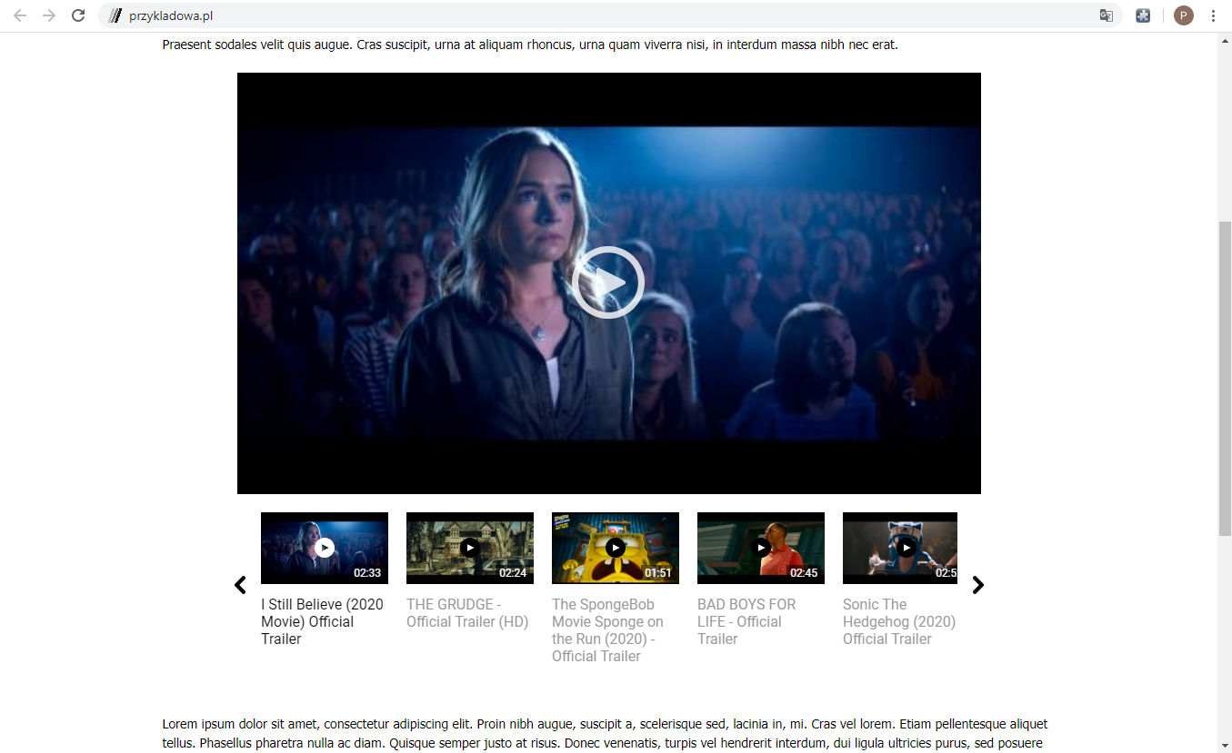
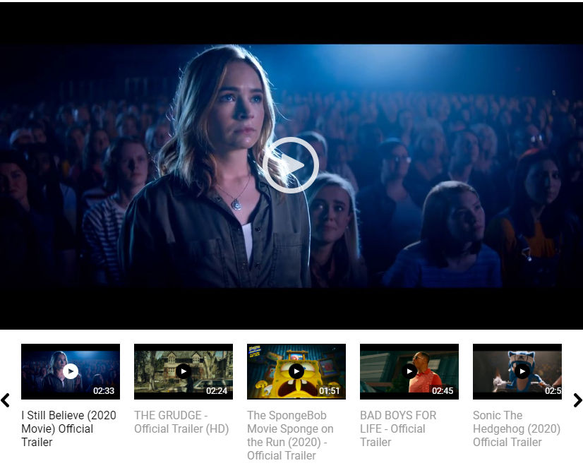
- Example of the website with widget on desktop [example]:
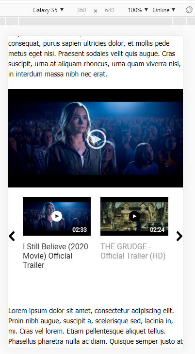
- Example of the website with widget on mobile device [example]:
- Advanced configuration of the widget look:
- To define the look of widget click Edit marked with blue arrow:
- Together with all the settings you get preview of the widget with video materials from chosen playlist. All the settings changes will be applied to the preview.
To minimize the preview click the icon marked with blue arrow:

- Part of the settings is divided into two columns: for desktop (marked with orange) and mobile (marked with green).
Settings can be copied from one column to another using in the Save setting options (marked with blue arrow) saving either desktop to mobile or mobile to desktop:

- Size of the player can be defined either in pixels or percentage of widget width. You can choose proper options in fields marked with arrows:
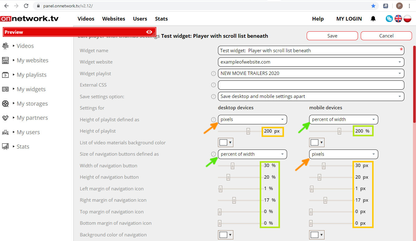
- Height of playlist (red line shows borders of the widget on the website):

- List of video materials background color:

- Navigation buttons:
Settings of the navigation buttons:- Width of navigation button
- Height of navigation button
- Left margin of navigation icon
- Right margin of navigation icon
- Top margin of navigation icon
- Bottom margin of navigation icon
- Background color of navigation
- Background color of hovered navigation
- Color of navigation icon
- Color of hovered navigation icon
- Playlist’ elements look:
Settings for playlist’s elements look:- Width of list item
- Background color of list item
- Background color of hovered list item
- Background color of selected list item
- Left margin of video thumb
- Right margin of video thumb
- Top margin of video thumb
- Bottom margin of video thumb
- Left margin of video title
- Right margin of video title
- Top margin of video title
- Bottom margin of video title
- Size of title font (px)
- Color of video materials list titles
- Title color of hovered item
- Title color of selected item
- Size of duration font (px)
- Color of item duration info
- Color of hovered item duration info
- Color of selected item duration info
- Background color of item duration info
- Background color of hovered item duration info
- Background color of selected item duration info
- Size of PLAY icon
- Color of PLAY icon circle
- Color of hovered item PLAY icon circle
- Color of selected item PLAY icon circle
- Color of PLAY icon triangle
- Color of hovered item PLAY icon triangle
- Color of selected item PLAY icon triangle
- Desktop and mobile settings for widget:
Player with the scroll list below like other widgets, playlists or websites may have different desktop and mobile settings. All the available options are available here: [example]
Green arrows point at buttons for desktop and mobile settings:
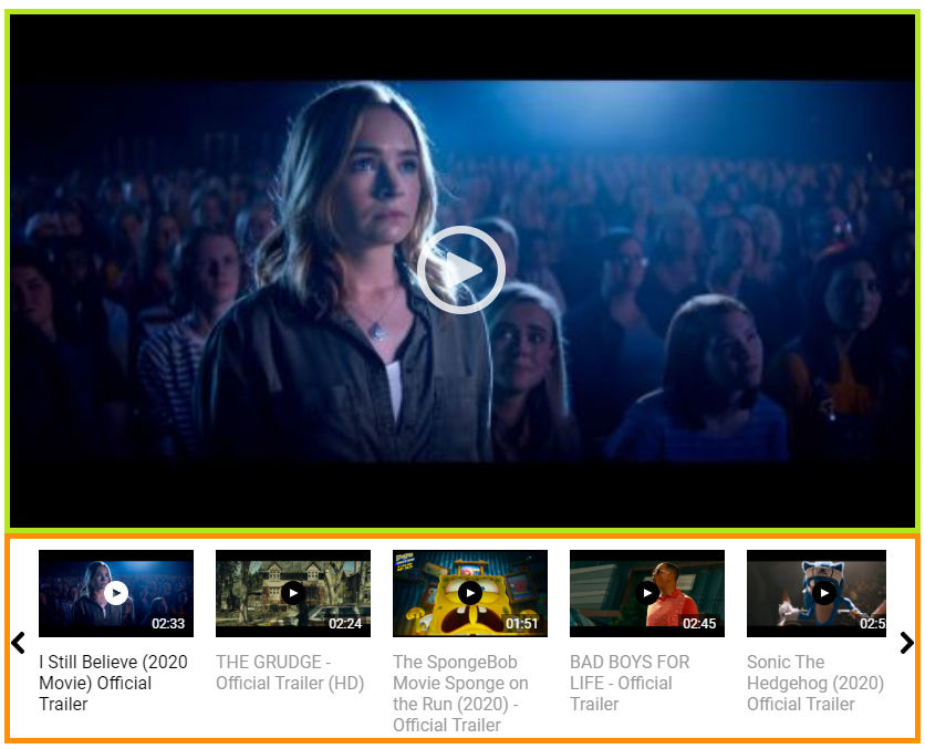
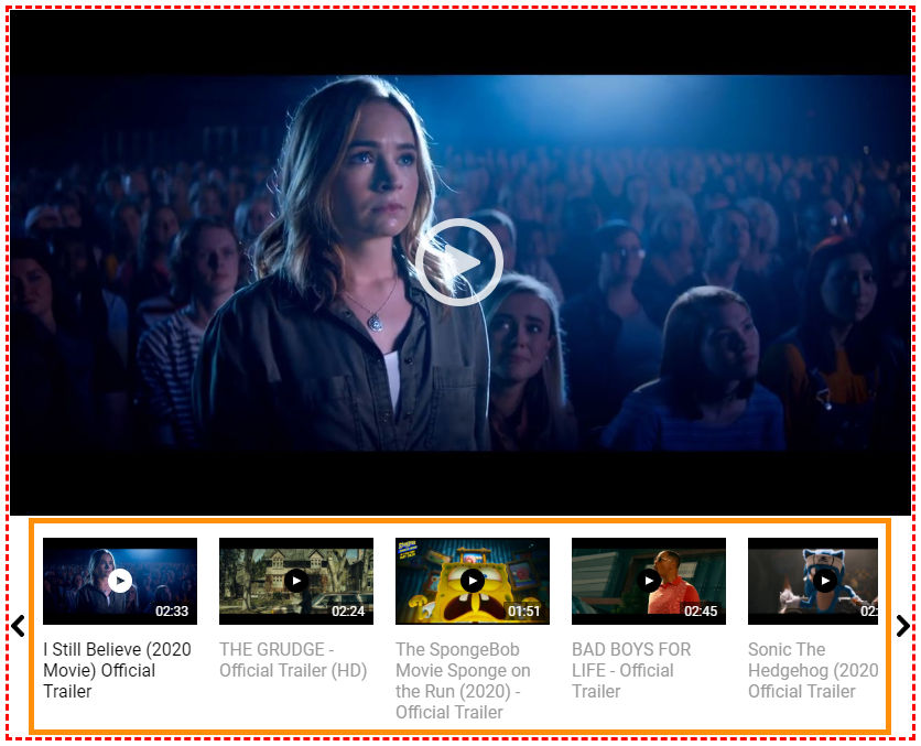
Player with scroll list below is brand new, the third type of widget enabling yet different presentation of the playlist with selected materials.
Scrolling the list is possible using navigation keys and dragging the list (on desktop) or motions (on mobile).
For mobile version it can be a good idea not to use the navigation keys at all by setting the width of navigation for 0px or 0% (more in advanced configuration of widget look). This setting will maximize area of miniatures of the playlist’s elements. [example]
Example of the default desktop look of the Player with scroll list below [example]:
Example of the default look of the Player with scroll list below in mobile version:
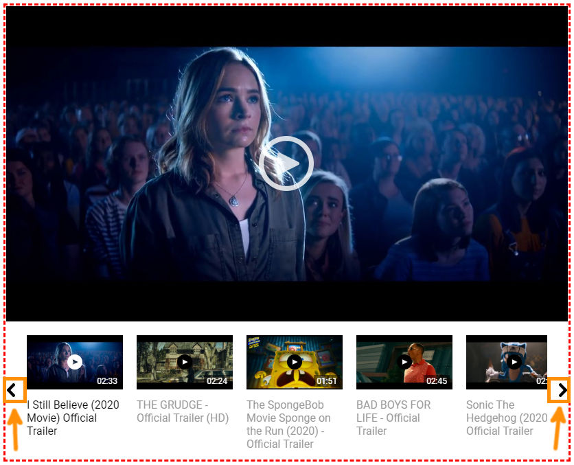
Widget consists of two parts – top and bottom. Top part is ordinary player – you can define look of it in website settings in the Player layout tab.
Bottom part is scrollable list that can be defined in the widget Edit tab. This part can have different settings for desktop and mobile devices.
Top part marked with green border, bottom part with orange border on the example below: